



How Do You Build One Color Story Across a Balance Stacking Range?
The first balance stacking set in a range is approved on its own merits. The sixth is where a line either reads as a collection or reads as six suppliers. This guide is written for brand owners, product developers and sourcing teams who need one palette to hold across every SKU — and a factory that can keep matching it after the first shipment, not just in the sample round.
What This Guide Covers
Fix two core colors for the whole range, add two or three secondary colors shared by every SKU, and give each SKU one accent color of its own. Decide what share of each product stays bare wood, and write that share down as a number, not an impression. Record all of it on a single palette sheet that gives every reference a role and a target share of painted area, then give each SKU a part-by-part placement map showing which part carries which color.
Keep the products distinct through silhouette and accent, not through new palettes. Before sampling, send a physical chip for every reference plus the wood species and finish for every part. Approve a painted reference on the actual substrate under one defined light, sign it, and hold that same signed sample against every bulk run. Wooden toy color consistency is a document held on both sides — not a pigment match that depends on who is inspecting the container.
1. Why Color Consistency Matters Across a Wooden Toy Range
A balance stacking set is an awkward product to build a range from, because the format is so simple. A base, a few rails, a handful of figures. Once the structure is settled, color is nearly the only lever left — which is why it gets decided fast, SKU by SKU, by whoever is holding the sample that week.
That is the wrong unit of decision. A retailer does not buy a balance stacking set; it buys a facing. A distributor photographs four sets on one table for one catalog page. An e-commerce seller needs a thumbnail that reads as a product rather than a pile. In each case the range is judged before any individual set is, and the judgement takes about a second: does this look like one brand's line, or like four things bought from four places?
Range planning runs into the same wall from the other direction. A buyer who wants to add a seventh set, or drop the weakest one, is making a decision about a family. If the family has no rules, both moves require redesign rather than arithmetic.
The commercial case is smaller than it sounds, and it is real. A coordinated palette costs nothing extra to specify — the parts are being painted either way. The absence of one is what carries cost. Group photography becomes impossible, so each SKU needs its own shoot and retouching. Packaging cannot share a system, so each box becomes a separate artwork job. And when a buyer drops one set, the survivors read as orphans rather than as a smaller collection. None of that appears on a quotation. All of it appears in the first season.
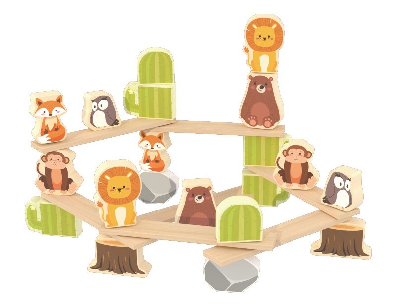
Figure 1 shows the raw material of the argument in one object: painted figures carried on bare hardwood rails. Every range has a painted-to-natural ratio like this whether or not anyone wrote it down. The only question is whether it was chosen.
To be precise about what this buys: a coordinated palette makes a range easier to present, photograph, range-plan and reorder. It does not make it sell. Color is a presentation asset, and presentation assets do not rescue a product that will not stack.
2. How to Build a Color Palette for Multiple Wooden Toy SKUs
Most brands building custom wooden toys arrive at a palette the same way: a mood board, a shortlist of shades everyone likes, then a sample. A shortlist has no internal logic, so nobody can say which shade to drop when a supplier reports that one of them covers badly on the wood you chose. Six attractive colors are a list. A palette is a set of relationships.
Two relationships do most of the work. The first is a shared value range — all mid-tones, or all deep tones — so no single part jumps forward and breaks the silhouette. The second is a stated contrast logic: either everything sits close together and one accent carries the contrast, or the palette is built from deliberate opposing pairs. Either way it should be describable in one sentence. "Blush, sage, butter, powder and warm beige, all mid-tone, with the accent on the smallest figure" is a description a factory can execute. "Soft pastel Scandinavian" is not.
Natural wood is a color in the palette, not the absence of one. Decide early how much surface stays bare. A line that reads as "wood with two colors" and a line that reads as "painted, with wood edges" can use identical references and still look like different brands — and they require different species, grades and finishing.
The four roles below are the structure that makes a palette repeatable across SKUs. They work because each role has a different approval burden: the core is approved once and defended to the end, the accent is re-decided per SKU and is cheap to change.
Palette roles at a glance
| Role | Share of painted area | Where it lands | What the spec must state |
|---|---|---|---|
| Core (two colors) | Most of it | Large faces, main bodies | Reference, substrate, finish, tolerance |
| Secondary (two or three) | A visible minority | Structure, secondary figures | Reference, and which parts carry it |
| Accent (one) | Small | One small part, repeated | The exact part, on every SKU |
| Natural wood | A stated share | Rails, posts, edges, frames | Species, grade, finish, edge treatment |
Swipe sideways to see the full table
Those shares are a starting structure rather than an industry formula. What matters is that they are written down before the first sample, because area changes how a color reads: a color occupying a fifth of one set and a third of another changes the impression of the line without a single reference being wrong.
The document that carries the system into production is the placement map: one page per SKU, every part named, every part assigned a role or marked as natural wood. It is the difference between a palette that exists in a presentation and a palette that exists on a factory floor.
If you are setting a direction for the first time and want a second opinion on how it behaves on wood rather than on paper, that is worth having before the palette is fixed — design development for custom wooden toys is the stage where changes are still cheap.
3. Six Color Directions for Wooden Balance Stacking Toys
The six directions below are structural options, not trend forecasts. Each solves a different presentation problem and opens a different production conversation. Choose one for what it asks of the wood, not for how it looks on a screen.
| Direction | Visual character | Production consideration | Where it strains |
|---|---|---|---|
| Soft pastels | Low contrast, light, mid-tones close together | Needs light, even-toned stock; higher coverage per part; tone differences between parts are visible | Small shade drift reads as two palettes rather than one |
| Natural wood plus muted color | Wood carries most of the surface; color used sparingly | Grain and tone become the most visible material, so species and grade must be specified | Batch variation enters the design; a single off-tone rail is conspicuous |
| Earth tones | Warm mid-to-deep browns, ochres, greens | Forgiving on stock with a warmer natural tone; deep shades need an even build | Edges show handling and burnishing more than light colors do |
| Bright primaries | High contrast, legible at thumbnail size | Requires clean coverage and sharp boundaries between colors | Reads less premium; every coverage defect is visible at retail distance |
| Warm neutrals | Cream, sand, clay, one dark anchor | Works with almost any stock; subtle differences between shades are hard to inspect | Can read as unfinished if the accents are too quiet |
| One accent on neutral | Nearly all neutral, a single color repeated | Minimal color, maximal consistency, fewest references to approve | The accent must appear on the same part in every SKU or the logic collapses |
Swipe sideways to see the full table
Two observations from working with these directions. First, the lightest and the darkest directions both fail in the same place — low-contrast palettes hide inconsistency until a group photo is taken, and high-contrast palettes expose every coverage defect immediately. Second, the directions that leave the most wood bare put the most pressure on material selection, because the wood is no longer a background; it is the product.
None of this is a market prediction. A direction is right when it survives the substrate, the coating system and the price point you actually intend to buy. One of those directions applied to a finished SKU: our penguin balance stacking toy pairs a natural-wood penguin with a single accent family, so the colour system has to hold across one substrate and one coating — a deliberately simple starting case.
4. How to Keep Different SKUs Visually Distinct Within One Color System
Consistency and repetition are different failures. A range where every set uses the same six colors in the same proportions looks like one product in six sizes. A range where every set has its own palette looks like a catalog. The useful middle is a fixed vocabulary with a variable grammar.
Six mechanics are enough to build it.
Shared core, different accents. Keep the two core colors identical across the line and give each SKU its own accent. The family is in the core; the personality is in the smallest part.
Different accent placement. The same accent color on a different part reads as a different product. Move it from the head of the largest figure to the base rail and the set changes character without a new reference.
Inverted proportions. Two sets can use the same references and read differently if the painted-to-natural ratio differs: one mostly painted with bare rails, one mostly bare with small painted figures.
A signature element. Choose one color that appears on exactly one part in every SKU — the same part, always. Buyers will not name it, but they will recognize the line by it.
A fixed natural finish. If rails and posts are bare or clear-finished in one SKU, keep them that way in all of them. One SKU with stained rails breaks a family faster than a wrong accent does.
Repeated pairings. Decide which two colors may sit next to each other, and reuse those pairings across formats. Viewers remember the pairings, not the individual colors.
Figure 2 applies that logic across two structures. One is a plank-and-figure stack; the other is a seesaw with a painted body and visible wood edges. Nothing about the construction carries over. The color family does.
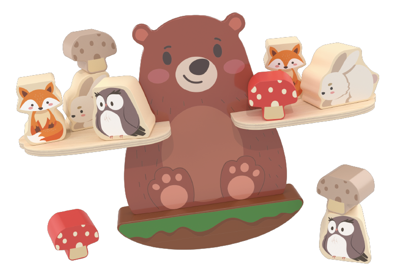
The rule that follows: let silhouette do the differentiation and let color do the recognition. Ten SKUs with ten palettes is not a range; ten SKUs with one palette and ten silhouettes is. When a new SKU needs to feel new, change the form or the dominant color — every reference you add is one more thing to approve, stock and control.
5. How to Specify and Approve Colors for Wooden Toy Production
Wooden toy color customization is won or lost at this stage, and rarely because of a design failure. It is a reference failure: the brand approves one thing, the factory matches another, and both behave reasonably given what they were sent.
Start with the five reference types
A screen value is not a reference. A hex code describes light emitted by a display. A painted toy is light reflected off a coating on wood, under whatever light the viewer happens to be in. Two uncalibrated screens showing the same hex code do not show the same color.
| What you send | What it is good for | What it cannot tell the factory |
|---|---|---|
| Hex value or a screenshot | Fast internal discussion; setting a direction | Substrate, gloss or coverage; screens are not calibrated to each other |
| Brand guideline swatch, printed on coated paper | Communicating brand intent and the approved brand color | How that color behaves on wood under a matte water-based coating |
| Pantone or RAL chip | A named, repeatable starting point both sides can look up | The appearance on your wood, or the tolerance you will accept |
| Painted panel on the actual substrate | The closest preview: same stock, same coating, same gloss | How it reads on a curved or edge-shaped part |
| Signed production sample | The reference for bulk; the only document that settles a dispute | Nothing further — this is the reference |
Swipe sideways to see the full table
Wood is a variable, not a background
Species, grain direction, sapwood and heartwood, knots, and the way end grain takes a coating all change how a color reads. A pale pigment on a warm species drifts; an open grain shows through a thin coat; a gloss change alters perceived lightness more than a small hue shift does. If a part stays natural, its tone is part of the palette — so species and grade have to be specified, not assumed.
Painted and printed surfaces are also different products. Paint sits on the surface and wraps the edge; print sits flat on a panel face and leaves the edge as cut wood. Both are legitimate, and they give a collection completely different readings. A buyer specifying direct UV print on 15 mm birch plywood may ask for a white ink underlayer beneath the process colors for opacity, and require the cut edges to keep their natural tone and grain. That is a specification a factory can execute. "Printed wood" is not.
Put a number and a method in the specification
A tolerance is a commercial agreement, not a default. No universal acceptable color difference can be applied on a buyer's behalf. ASTM D2244-23, Standard Practice for Calculation of Color Tolerances and Color Differences from Instrumentally Measured Color Coordinates, covers the calculation of tolerances and small color differences for opaque specimens such as painted panels. Its scope states that for product specification, the purchaser and the seller shall agree upon the permissible color tolerance and the procedure for calculating it, and notes that each material and condition of use may need its own tolerance because gloss and texture affect how a measured difference correlates with commercial acceptability.
The same practice recommends ΔE00 (CIEDE2000) for differences in the 0.0 to 5.0 range, and it points to visual appraisal practice D1729 for correlating instrumental values with what a trained eye accepts. Read that as an instruction, not a limitation: put a number, a formula and an instrument in the specification, or accept that "close enough" will be decided by whoever inspects the shipment.
Approve under one defined light
ISO 3668:2017, Paints and varnishes — Visual comparison of colour of paints, specifies a method for visually comparing paint films against a standard using artificial light sources in a standard booth. It exists because approval under mixed light is unreliable: two samples can match under one source and separate under another. The standard is not applicable to coatings containing special-effect pigments without prior agreement on illuminating and viewing conditions, which is worth knowing if a pearlescent or metallic finish is ever proposed.
Phone photographs by a window are the most common approval instrument in this industry and the least stable one. Photograph the approved sample for the file. Do not approve from the photograph.
Separate a coating change from a compliance question
Directive 2009/48/EC remains the instrument that applies to toys on the EU market today. It requires manufacturers to keep series production in conformity and to take changes in product design or characteristics into account — Article 4(4). Regulation (EU) 2025/2509, adopted on 26 November 2025 and published in the Official Journal on 12 December 2025, entered into force on 1 January 2026 and applies from 1 August 2030, when it repeals the Directive; toys placed on the market in conformity with the Directive before that date may continue to be made available. As of November 2026 the Directive is still the operating framework, and the Regulation's chemical, safety-assessment and digital product passport requirements are a 2030 obligation — not a current one.
A new coating, a new colorant or a change of paint supplier is a change of characteristics under either instrument. Surface coatings are among the materials assessed for elemental migration under EN 71-3, whose current harmonised citation is published in the Commission's list of harmonised standards for toy safety. That does not mean every color change triggers a full retest. It means the change should be assessed and recorded, and the useful question is narrow: does the test report you hold describe the coating that is about to be used? If it names a different supplier, formulation or pigment system, the report describes a different material. Ask it in writing before the colorway is confirmed, and agree who commissions any additional testing.
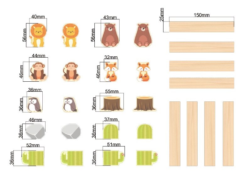
Figure 3 is the sheet a placement map gets written from: the same set broken out part by part, painted faces on one side, bare rails and posts on the other. Color decisions are made at this level, not at the level of a mood board.
6. From Color Concept to Mass Production: An Eight-Step Workflow
The workflow below holds up because each step produces a document rather than a decision. It is also the part of wooden toy product development where a range is cheapest to correct: everything here happens before tooling and before packaging artwork.
| Step | What happens | Who owns it | What you should have afterward |
|---|---|---|---|
| 1. Define the visual direction | Agree what the range is and is not | Brand | One page: three reference images, a short description, a "do not" list |
| 2. Build the core palette | Assign roles, shares and permitted pairings | Brand, with factory input on coverage | Palette sheet: one row per reference, with role and target share |
| 3. Apply it to each design | Decide which part gets which color | Brand and product developer | Placement map per SKU, part by part |
| 4. Review proportions across the range | Put every SKU on one sheet, printed small | Brand | A single comparison sheet, checked at thumbnail size |
| 5. Confirm physical samples | Paint the actual substrate, not paper | Factory | Panels or first-off parts in every reference |
| 6. Evaluate under one light | View parts together, same source, same angle | Both sides, together if possible | A dated viewing record naming who approved what |
| 7. Approve the production reference | Sign the sample set bulk will be matched to | Brand, countersigned by factory | One signed reference per colorway, held by both sides |
| 8. Hold the reference in production | Match bulk to the signed sample, not to memory | Factory, audited by brand | A named reference holder and a written rule for paint lot changes |
Swipe sideways to see the full table
Step 4 is the one teams skip and the one that catches most problems. A palette that looks disciplined as six swatches can fall apart as six products, because area matters more than hue.
Steps 5 to 8 are where the sequence stops being design work and becomes production control. A wooden toy manufacturer can only match a reference it has been given, so from step 5 onward the factory owns the evidence and the brand owns the approval. How each step is handled varies with product structure, materials, degree of customization and the manufacturer's own manufacturing process — a factory that prints panel faces has different checkpoints from one that paints and wraps edges. The sequence is stable; the contents of each step are not. Where that workflow meets piece-count, spare parts and retail packaging — the questions that dominate multi-component sets — our guide to farm block sets and retail-ready packaging works through the same eight steps with a BOM-heavy example.
7. What Buyers Should Prepare Before Requesting a Wooden Toy OEM Quote
A coordinated range is not harder to make than a single SKU. It is harder to schedule, because it multiplies the number of things that need approving in the same window. Buyers developing custom wooden stacking toys arrive with a pack rather than a mood board, and get a quote that can be compared with another supplier's quote.
- Product drawings or reference images, with the parts that must stay natural marked
- Number of SKUs and the colorway count per SKU, since a colorway is usually quoted as its own line
- Color palette with each reference given a role — core, secondary or accent
- Color placement map per SKU, part by part
- Wood species or panel type per part, including parts left unfinished
- Paint or print, with the finish and gloss level you expect
- Color tolerance and the measurement method you will accept
- Target market and age group, which decide which parts of the coating assessment apply
- Expected quantity per style and per colorway
- Sample approval requirements: who signs, on what substrate, under what light
- Target production schedule, including the season the order needs to ship in
Three questions are worth asking any wooden toy supplier before a range is committed. Which parts will be painted, which printed, which left natural — and will that split stay the same on every SKU? Who keeps the approved reference, and what is the procedure when a batch of coating does not match it? If one color changes after approval, what else changes — artwork, sampling, packaging panels, the scope of the existing test report? A supplier who answers the third without hesitating has done this before.
8. Frequently Asked Questions
How do you maintain color consistency across multiple wooden toy SKUs?
By making the specification single. One palette with named roles, one reference per role, one substrate defined per part, one agreed tolerance with its measurement method — a ΔE limit, the instrument and a defined light source such as D65 — one signed reference held by both sides, and a written rule for what happens when a paint lot does not match. Wooden toy color consistency comes from a document both parties work to, not from a factory trying harder on each run.
Is a Pantone or RAL reference enough for wooden toy color matching?
No. A chip defines a target on coated paper; it says nothing about your substrate, your coating system, gloss, or the tolerance you will accept. It is the starting point of a conversation, not the end of one. Send the chip, a painted panel on the actual wood, and the tolerance you want applied — a ΔE value with the instrument and the D65 light source named, because those are the numbers the bulk run is actually judged against.
Why does the same paint color look different on different wood species?
Because the substrate is part of the optical system. Species tone, grain, porosity, tannin content and the difference between face grain and end grain all change how a coating builds and how much light returns. A light color on a warm species drifts warmer; an open grain shows through a thin coat; a satin finish reads darker than a gloss finish carrying the same pigment. On 15 mm birch plywood a direct UV print may need a white ink underlayer for opacity, while the same ink on dense beech does not.
How should buyers approve wooden toy paint colors before mass production?
On the actual substrate, at the actual gloss, with all parts viewed together under one defined light — a standard viewing booth per ISO 3668 or a consistent daylight source used the same way every time. Record who approved, the date, and the light source. Keep one signed reference per colorway. Photograph it for the file, but never approve from a photograph.
What is the difference between a color sample and an approved production sample?
A color sample proves a reference is achievable on your substrate. An approved production sample is the signed physical reference — taken from the first-off production parts, same process and same coating system — that bulk is matched against, together with the tolerance and method in the specification; a colour sample fits inside the usual 7–10 working-day sample window, while the production sample only exists once the bulk line runs. One answers "can you make this"; the other answers "this is the standard".
Can changing paint suppliers affect wooden toy compliance?
It can. Coatings are among the materials assessed for elemental migration under EN 71-3, and a new supplier means a different formulation and possibly different pigments or driers. That does not automatically require a full retest. It requires a documented assessment: check whether the report you hold names the coating now being used, and if it does not, test the coating as used. Agree in writing who commissions the work and who holds the result.
What should importers include in a wooden toy color specification?
For each part: the reference (physical chip plus code), the substrate species or panel type, whether it is painted or printed, the finish and gloss, whether coverage is opaque or translucent, the tolerance in ΔE with the formula and instrument, the light source used for approval (D65 or the actual booth), the target share of painted area as a recorded percentage, and the parts that stay natural with their species and finish. Add the name of the reference holder on each side and the procedure for a lot mismatch.
9. How KIDMERRY Supports Custom Wooden Toy Development
KIDMERRY manufactures wooden toys in Yunhe, Zhejiang, for brand owners, importers, wholesalers and retailers on OEM, ODM and private-label terms, with water-based paint finishes. The work that a color system depends on sits in three places: design development, where a palette is tested against real structures before tooling; sampling, where references become painted parts on the specified substrate; and production, where the signed reference is held against each run.
Where the palette meets the factory floor, the manufacturing capability and wooden toy quality control pages describe how parts are cut, finished and inspected, and the OEM and ODM customization page covers how a custom program is scoped. Sampling runs 7 to 10 working days for an existing shape and 15 to 20 working days for a new drawing; bulk runs 30 to 45 days after sample approval, extending to 45 to 60 days in the Q2 to Q3 peak season. These are factory planning figures on our own schedule, not industry statistics. Minimum order quantities are quoted per style and depend on colorway count, tooling and run size — which is why the palette sheet belongs in the first email rather than the third.
The range context for this category sits in our wooden building and construction toys line, and a forest animal balance stacking set shows how painted figures and bare rails are normally combined.
If you are planning a balance stacking range and want the palette settled before the first sample, send us the direction you have — even a rough one. A shortlist of colors, the parts you want kept in natural wood, the number of SKUs and colorways you have in mind, and your target market are enough for a placement proposal, a sampling plan and a clear answer on what a color change does to the rest of the specification.
Develop a Custom Balance Stacking Range
About Kidmerry: Yunhe Kidmerry Toys Co., Ltd is a wooden toy manufacturer based in Yunhe, Zhejiang, China. The factory runs in-house CNC machining, finishing and assembly, and holds ISO 9001:2015 certification, with FSC-certified board available on request. Sampling takes 7–10 working days for existing styles and 15–20 working days for custom drawings; bulk production runs 30–45 days after sample approval. Ask Kidmerry for a quotation, a sample set and third-party test reports before your next development cycle.
Request a Quotation